How to build advanced layouts in Flutter
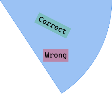
Can we position widgets within custom shapes in Flutter? Actually, the framework provides a solution for building any kind of layout logic using CustomChildLayouts. I will show you how to implement a CustomMultiChildLayout to center any widget within the slice of a circle. How to draw that slice using a CustomPainter is shown in my previous article in this series. This example is relevant, since all widgets in Flutter are based on rectangular boxes with each slice actually having the following bounding box.

Therefore, we cannot use widgets like Center or Align in this scenario, since they position relative to the bounding box. Time to introduce the MultiChildLayoutDelegate: a base class for providing your own layout logic by implementing the performLayout(Size) method. Within this method two tasks need to be performed:
- all children are given their box constraints
- the resulting boxes are positioned within the available bounds
To identify child widgets, the framework provides us with the hasChild method. In order for them to work properly, each child needs to be given an ID, which can be understood as the role it takes within the layout. The following code shows how this is achieved using the LayoutId widget.
enum CircleSliceLayoutSlot {
  Slice,
  Child,
}

class CircleSliceLayout extends StatelessWidget {
  final Widget child;
  final CircleSlice slice;

  const CircleSliceLayout({this.slice, this.child});

  @override
  Widget build(BuildContext context) {
    return CustomMultiChildLayout(
      delegate: CircleSliceLayoutDelegate(slice.angle),
      children: [
        LayoutId( // ⬅ ⬇
          id: CircleSliceLayoutSlot.Slice,
          child: slice,
        ),
        LayoutId( // ⬅ ⬇
          id: CircleSliceLayoutSlot.Child,
          child: Transform.rotate(
            angle: slice.angle / 2,
            child: child,
          ),
        ),
      ],
    );
  }
}
An enum helps us to distinguish between the circle slice and its child widget, which makes the code more readable and maintainable, but you could also use raw values/constants. Now let's look at the CircleSliceLayoutDelegate implementation.
class CircleSliceLayoutDelegate extends MultiChildLayoutDelegate {
  final double angle;

  CircleSliceLayoutDelegate(this.angle);

  @override
  void performLayout(Size size) {
    Size sliceSize;
    Size childSize;

    if (hasChild(CircleSliceLayoutSlot.Slice)) {
      sliceSize = layoutChild(
        CircleSliceLayoutSlot.Slice,
        BoxConstraints.tight(size),
      );
      positionChildCircleSliceLayoutSlot.Slice, Offset.zero);
    }

    if (hasChild(CircleSliceLayoutSlot.Child)) {
      childSize = layoutChild(
        CircleSliceLayoutSlot.Child,
        BoxConstraints.loose(size),
      );

      final topRectVector = Math.Point(sliceSize.width / 2, 0.0);
      final halfAngleVector = rotateVector(topRectVector, angle / 2);

      positionChild(
        CircleSliceLayoutSlot.Child,
        Offset(
          halfAngleVector.x - childSize.width / 2,
          halfAngleVector.y - childSize.height / 2,
        ),
      );
    }
  }

  @override
  bool shouldRelayout(CircleSliceLayoutDelegate oldDelegate) {
    return angle != oldDelegate.angle;
  }
}
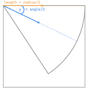
Within performLayout, we first search for the slice widget by its ID and expand its box constraints to fill the available bounds. The child widget is supposed to only take up space it actually needs, which can be achieved by using loose box constraints. Centering this box within the slice is the tricky part. The image below visualizes the math involved in finding the correct offset for the child.

We want to position the child widget on the line, which cuts a given slice in half. To achieve that, we start of with a vector that points to the center of the top edge of our bounding box starting from its top left. This ensures that the vector's length is half the circle's radius. To actually point to the center of our slice, we need to rotate this vector by half the slice's angle, which gives us the blue vector in above illustration.. If you are interested in how the rotateVector works, you can find its implementation in this package's Github repository. With the slice's center at hand, the child's offset can be retrieved by adjusting the center to the child's size. If you believe there is a simpler way to achieve the same result, I encourage you to send me a message or comment with your ideas about this problem; I am always glad to learn of new features and tricks.
The last aesthetic adjustment is a child widget's rotation. Since I use text children in the examples, it makes sense to run them along the vector's line. As can be seen in the first code sample, this is achieved by wrapping it in a Transform.rotate with half the slices angle. But for icons or other use cases no rotation or another angle might be necessary, so this is up to your use case.
Finally, we can build a fortune wheel from individual slices, each having correctly centered children. This shows that CustomMultiChildLayouts do not necessarily be composed of many widgets and can also be used for describing complex parent-child relationships. If you have any questions about this example, feel free to reach out to me or consult the MultiChildLayoutDelegate docs.
In my next article in this series, we will make the wheel actually spin using animation curves. Until then, you can spin the wheel yourself by installing it from pub.dev.